
Context
In preparation for PlaySpace's market launch, the product, design and dev team was tasked with rebuilding the platform from the ground up. As the sole product designer, I re-designed the platform, updated the information architecture, fixed core UX issues, and refreshed the visual language.
Role
Product Designer
TEAM
2 Product Managers
3 Developers
1 QA
3 Clinical Advisors
Duration
4 months
Skills
Design Systems
Figma Variables
UI/UX
User Research
Prototyping
Impact
20 pages and 18 features redesigned
6 pages and 19 features introduced
Refreshed visual language
that better reflected brand identity and values
Before vs. After
There were 2 key problems in the old platform:
Lack of design foundation
The existing tech stack was built on hard-coded styles, an incomplete component library, and a visual language that didn't match the broader brand identity — creating a disconnected user experience and unscalable system.
Unclear information architecture
Navigation and organization made existing features hard to discover, while we simultaneously had to account for new features being added without a clear roadmap.
Image: Before (left) and after (right) design of the homepage in PlaySpace's platform. Drag the slider to compare!
Image: Before (left) and after (right) design of the storybook editor in PlaySpace's platform. Drag the slider to compare!
Image: Before (left) and after (right) design of the clinic members page in PlaySpace's platform. Drag the slider to compare!
Components
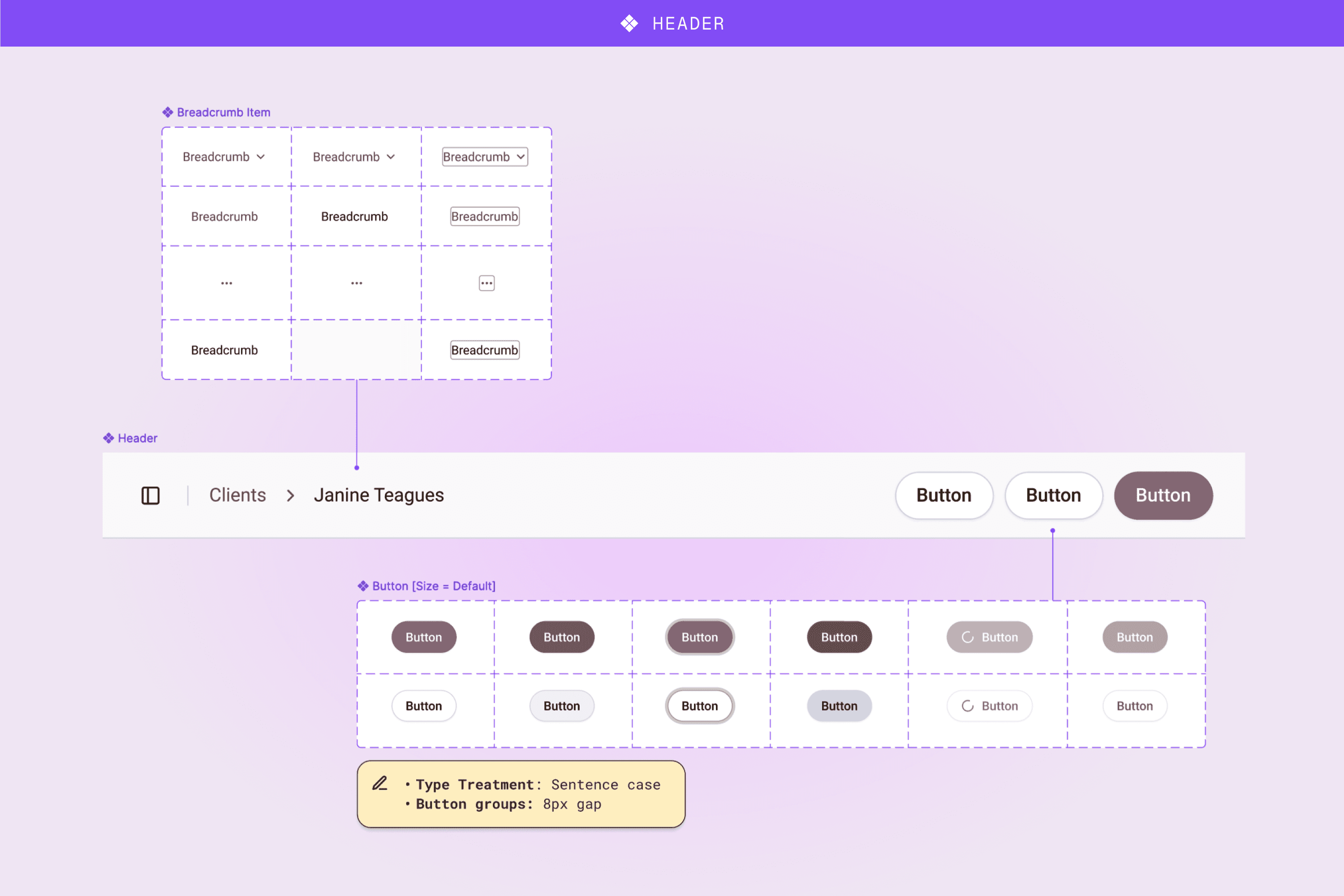
Image: Breakdown of the atomic components used in the header component across pages.

Image: Breakdown of the atomic components used in the card component.

Image: Breakdown of the molecular components used in tables.
process
Leveraging an open-source component library
Given our time constraints and a highly ambiguous roadmap, the dev team and I researched customizable open-source component libraries that would allow us to start working from the same source immediately. We landed on shadcn/ui for its clean design — which worked great for healthcare — and matching code and Figma files with built-in variables.

Image: Opting for Shadcn's open source component library instead of building from scratch.
I intentionally kept customization minimal and used the library's default components to maintain consistency with development. With the roadmap still taking shape, over-customizing the UI would have been premature. Instead, I focused on user journeys and mapping out the information architecture, knowing we could customize when the product direction was more defined.

Image: WIP of the information architecture.
Leading with user research
I interviewed several practicing clinical advisors to identify quick wins for usability improvements and features that were less used. These findings helped the product team prioritize scope:
5 core features improved
7 features dropped


Images: Examples of practitioner feedback for the playrooms overview & editor
Experimenting with AI for additional support
To stay competitive with the market by the time of launch, we needed to add new features while rebuilding existing ones. With limited design resources, the dev team and I explored AI tools to support our process:
1
I used UXPilot, Lovable and Figma Make to help visualize early concepts and prototype simple flows and interactions.


2
Final designs were refined in Figma and mapped back to components and variables before developer handoff to maintain quality and consistency.


🔄 Tradeoff
Based on customer surveys showing majority desktop/tablet usage, we deprioritized manual mobile designs. Instead, the dev team used AI to generate responsive layouts from my desktop designs, which proved effective enough given our tight timeline.

Customizing components and variables
One week before launch, I received feedback that the platform needed a stronger brand presence.
By this point, the product was more defined so I had a clearer sense of which components were actually being used. However, shadcn's variables library was dense, and I knew that any changes would need code updates as well. To accommodate for the timeline, I focussed on 2 elements that I knew would guarantee quick wins: colour and radius changes.
I developed colour ramps based off the brand colours, and worked with the marketing designer to test component colours and radius options on a couple of pages before finally landing on an approved direction.
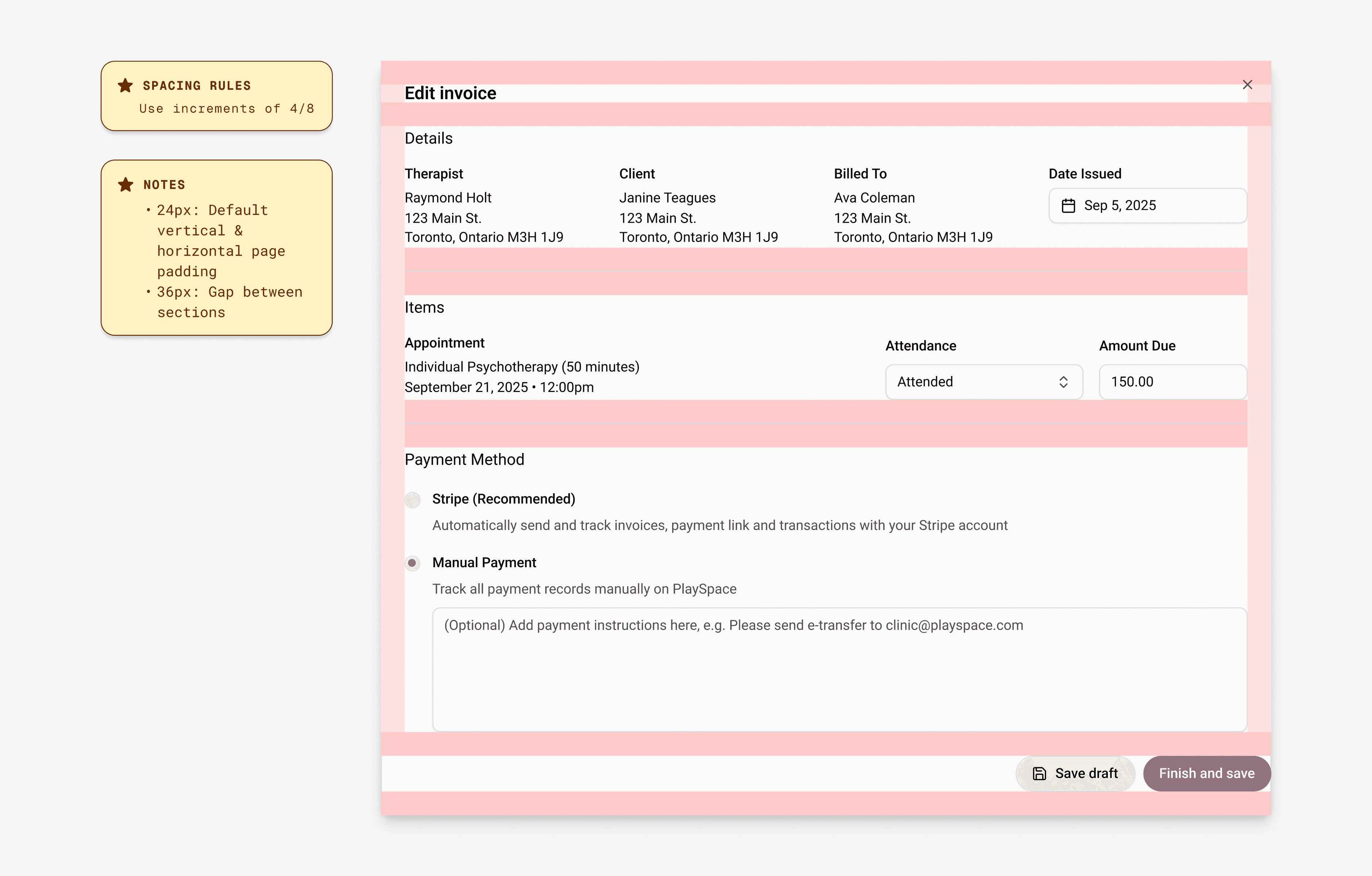
Image: Identified areas for quick brand wins throughout platform.
At the same time, I brought the developers together to align on the plan. I modified the original tokens, adjusted their application on components in order to match the updated visual direction, and simplified the overall component library so the developers could prioritize updates.

Image: Simplified and customized Figma variable library from the original.


Reflection
The tradeoff between speed and fit
Using an established component library let us move incredibly fast, but it's hard to know what system will actually fit your needs without a defined product. Knowing what I know about the product now, I may have looked for a simpler system than shadcn to build off of.
Lessons in scalability
Customizing and defining a design system takes significant time and resources, and I can see significant areas where this one could be improved for proper scalability and long-term use. I've since been practicing those skills on my own — contact me to learn more!
Maintaining sync between design & code
At this stage, the design system would need regular manual syncs with the devs in order to maintain consistency across design and code. I would look into tools like Storybook and Zeroheight to implement an automatic sync system to make this alignment easier.


